Posted by Swetal
As soon as you are engaged, the first question that everyone asks is "Have you set the wedding date yet?". This has got to be the most dreaded question for any bride-to-be. However, today we will talk about the 2nd most dreaded question. "What are your wedding colors?" A question often asked by family and friends who are excited to chat with you about the wedding!
The colors you choose have a significant impact on the look & feel of your wedding. This is why it becomes a daunting task for most brides. Where is the starting point? What 2 colors am I going to choose? Well, first of all, let's just say I want to go back in time and ask whoever said that you need to narrrow down to 2 colors... WHY TWO? I feel like 2 colors can be restrictive and should be reserved for schools, sports teams, or uniforms!
There are so many aspects to a wedding such as bridesmaids' outfits, invitations, menus, lighting, flowers, linens, stage decor, and lots of small details. Why not go for a color palette with multiple shades! That way, you can be so much more flexible as you shop and choose various parts of your wedding. This takes away the stress of settling for 2 colors and gives an opportunity to be creative. You don't have to be boxed into just 2 exact colors and compromise.
How to pick a color palette? Here, you can start by choosing 1, 2, or even 3 major colors and then also incorporate more colors that are complimentary. You can even take a couple colors and use various shades of those colors! The possibilities are endless. Try to find something that you are really drawn to such as a piece of art, boquet of flowers at a shop, your favorite outfit, historical architecture, or just a picture from the web! Pretty much find something you think is visually appealing and that makes you feel good. Then, draw out some shades of colors within it as a starting point. I personally get inspired by indian outfits, jewelry, or things I spot through my travels. The easiest part here is that colors are everywhere and in everything, but you just have to pick them out!

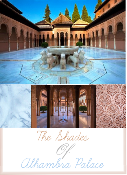
For example, I want to leave with a palatte I put together based on inspiration from one of my favorite architectural sites from my travels - Alhambra Palace in Granada, Spain. My husband and I visited here on a summer day in the afternoon and stayed here until the sunset. My favorite part of the palace is the center courtyard with white marble flooring open to the bright blue sky. The sky blue reflecting on the white marble tiles create the perfect POWDER BLUE hue and that gets paired with the sun hitting the pinkish gold carved walls creating a perfect ROSE GOLD shade!
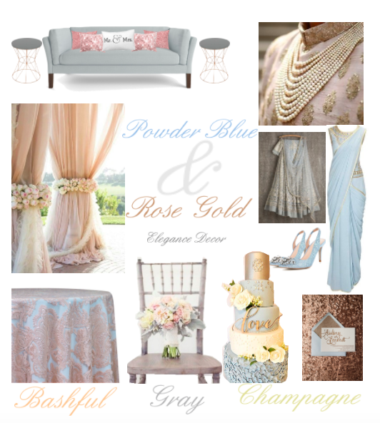
There you have it! Powder Blue & Rose gold with shades that compliment these 2 major colors - bashful, gray, and champagne. I took a place and memory that made me feel good and then looked for the colors from the setting and just added softer tones that complimented it. I would love for you to try this method for your next color scheme! Meanwhile, what do you think about this color scheme for your special day?


